The S&P 500 Index returned -13.52% in the quarter ended December 31, 2018, and -4.38% for the full year.[1]
During periods of downward market volatility, most people experience pain and discomfort as the value of their account declines. This pain is exacerbated by the many doom-and-gloom media commentators that seem to sprout up like weeds in bear markets. Wanting the pain to cease, many investors decide to sell all or a portion of their “risk” assets, putting them instead into “risk-free” assets such as Treasury bills, Treasury bonds, and cash. We believe investors should actually be doing the opposite and adding to their “risk” assets. But emotions are powerful motivators, and, therefore, we all need a strategy to realign our emotions with the, in our view, rational response of purchasing risk assets during market downturns. The most successful strategy we’ve found is to use data on long-term returns to lessen “risk” asset fear and to increase “risk-free” asset discomfort. As you’ll see in the following section, this task is surprisingly easy-to-do once you actually see the data in graphical form.
“Risk-free” vs. “Risk” Assets
If risk is measured by short-term volatility in the price of an asset, then cash is the ultimate risk-free asset. No matter what’s going on in the world, the $100 you stash in your safety deposit box will still be $100 the next time you check on it. It won’t be $99. It won’t be $101. It will be $100. However, is that really what we care about? That the number on the bill stays the same over time? It shouldn’t be. Money is a claim ticket on society’s goods and services, and, therefore, the real concern we should have as savers is whether that claim ticket can be traded in for the same amount of goods and services over time. In other words, we should care about the purchasing power of our savings over time. And, on this metric, cash should frighten investors more than any other major asset class.
In order to gain or retain power, government leaders almost always promise more spending than tax revenues can support. Since reneging on their promises is tantamount to political suicide, these leaders choose instead to finance their promises through a variety of less politically costly methods. Because it’s a largely hidden cost to a country’s citizens, the most popular of these methods is printing money. In fact, governments print so much money that the supply of money increases more rapidly than the supply of goods and services, leading to a rising price for the supply of goods and services and lower purchasing power for money. This process is referred to as inflation. Over time, this compounding inflation has had a catastrophic impact on the value of the $100 sitting in the safety deposit box.
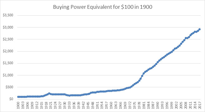
As the chart[2] above shows, $100 put into a safety deposit box in 1900 would still say $100 on it in 2017, but it would be far less valuable. In fact, you would need $2,918 to have the same purchasing power as the $100 bill gave you in 1900, a staggering decline in value of 96.6%. This decline is a compound rate of negative 2.9%, meaning that a person who put all their money in dollars lost, on average, 2.9% of their purchasing power every year.
Let’s now turn to bills and bonds. Bills are fixed income loans to governments with terms of less than a year. Bonds are fixed income loans to governments with terms longer than 10 years. In order to induce investors to lend money to them, governments generally have to pay investors an interest rate on the money they borrow. Moreover, in most environments, investors require a higher interest rate to loan the government money for longer periods. Because most governments have taxing authority as well as the ability to print their own money, they are highly likely to pay investors the agreed-upon principal and interest, and, therefore, investors generally view government bills and bonds as the safest investments. Hence, the interest rates charged on each government’s bills and bonds are considered each country’s risk-free interest rate.
However, using our definition of risk (purchasing power of our savings over time), bills and bonds appear much riskier.
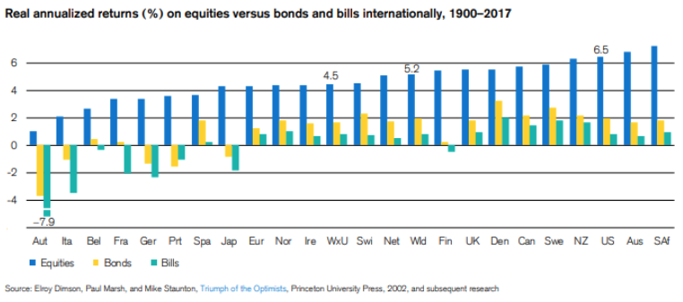
As you can see in the chart above, of the 21 countries listed, almost all had compound annual real (after inflation) returns on their bonds and bills of 2% or below for the period from 1900 to 2017. Moreover, in a finding that shocked even us, 8 of the 21 countries listed actually had negative compound annual real returns on their bills, and 5 of the 21 had negative compound annual real returns on their bills and their bonds. This result means that, in these 5 countries, a person who invested in “risk-free” bonds and bills had less purchasing power at the end of the 117-year period than at the beginning. In fact, in these 5 countries, a person who invested 50% in bills and 50% in bonds would have lost more than 50% of their purchasing power by the end of the period. In Austria, this person would have lost more than 90% of their purchasing power.
It gets worse. In the analysis above, we didn’t include any tax drag. In the real world, however, many investors must pay taxes on their interest income. To understand the impact of these taxes on investment returns, let’s calculate the after-tax bond and bill returns of a representative country. Fortunately, since we live in it, there’s no better choice than the United States, which has government bond and bill returns remarkably similar to the world averages as well as the best available data on tax rates. To calculate after-tax returns, we first have to convert the real returns above to nominal (before inflation) returns. As you can see in the chart above, U.S. long-term government bonds returned 2.0% real from 1900 to 2017, and Treasury bills earned 0.8% real, both of which are remarkably close to the world’s bond and bill returns. Adding in the 2.9% compound annual inflation rate we mentioned in our cash analysis yields 4.9% and 3.7% nominal returns, respectively. Now, let’s decide on a tax rate. The chart[3] below is a great place to start because it shows the U.S.’s top marginal income and capital gains tax rates over time.
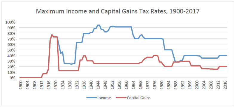
Interest income from government bonds is taxed as income, so the income tax line is the relevant one for our analysis. As you can see, from 1900 to 2017, the top federal income tax rate has oscillated between 0% (the rate before the inception of income taxes in 1913) and 94% with the average tax rate over the period at 52.0%. For a high-earning investor whose interest income was all taxed at the maximum rate during this period, taxes would have reduced his or her compound annual nominal return to 2.4% for U.S Treasury bonds and 1.8% for U.S. Treasury bills. Subtracting out 2.9% for inflation to convert these nominal returns to real returns, U.S. Treasury bonds and bills would have generated compound annual real returns for our hypothetical high-earning investor over this 117-year period of -0.5% and -1.1%, respectively. While -0.5% and -1.1% compound annual returns don’t seem like much, they would have cut your purchasing power by 44.4% and 72.6%, respectively, over this 117-year period. If the high-earning investor lived somewhere with state and local taxes, the results would have been even worse.
In conclusion, while “risk-free” Treasury bills and bonds certainly have less volatility, just like in the case of cash, we believe they are very likely to leave you with substantially less purchasing power over time. Given these results, these supposed “risk-free” assets seem to be offering “return-free” risk.
On the other hand, as you probably already noticed in the “Real Annualized Returns” chart above, the “risky” public equity category, while undoubtedly more volatile, has actually proven much less risky over time if measured according to its ability to maintain and grow purchasing power over time. In all 21 countries, equities produced positive real returns, with most generating between 3% and 7% real returns over time for a world average of 5.2%.
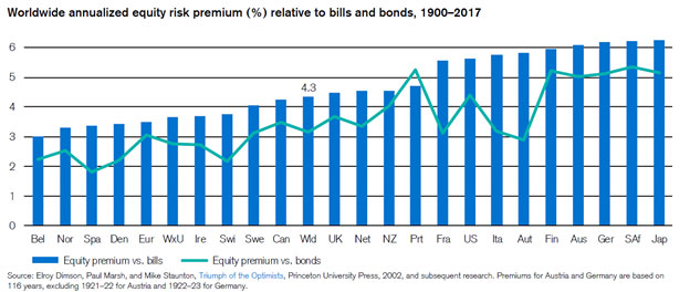
Also, as the chart above shows, equities handily beat Treasury bills and bonds in all 21 countries, outperforming by at least 1.8% per year and in some cases by more than 6% for a world average outperformance of 4.3% for bills and 3.2% for bonds. While this differential doesn’t seem like much, it’s compounded effect over many years is astounding, as you can see below.
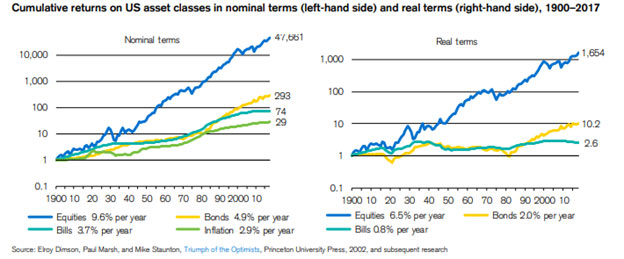
Over the period from 1900 to 2017, an investor who stayed 100% in U.S. equities multiplied his or her purchasing power by 1,654 times versus investors in bonds and bills that only multiplied their purchasing power by 10.2x and 2.6x respectively. And, again, at least for U.S. investors who held U.S. equities for longer than a year, this huge compounded advantage is actually significantly understated when taking taxes into account. While top ordinary tax rates oscillated between 0% and 94% with an average of 52.0%, maximum capital gains rates mostly oscillated between 10% and 40% with an average over the full 117-year period of 23.0%. Assuming our high earning investor from our earlier example invested all of his or her money in stocks instead of bonds and bills and sold and bought back 100% of his or her stocks every year, he or she would have achieved compound annual nominal returns after taxes of 7.4% and 4.5% per year after inflation. If the investor never traded in and out of his or her stocks over this period and only paid taxes at the end of the period, this return jumps to 9.4% nominal after taxes and 6.5% after taxes and inflation. Thus, our hypothetical high-earning investor who invested 100% of his or her money in U.S. equities would have multiplied his or her purchasing power by somewhere between 172 and 1,585 times even after taxes.
There were a lot of numbers in this analysis, so let’s summarize. When discussing risk, many investors and commentators are primarily referring to the volatility of a portfolio value on a day-to-day basis. Thus, cash, short-term government bills, and long-term government bonds, by this definition, are largely “risk-free” assets while stocks are “risky.” However, by the, in our view, much more meaningful definition of risk–how likely am I to maintain or even grow my purchasing power over time–the reverse is true, and the gap in risk isn’t even close. Using the data in the charts throughout this letter and our prior assumptions on tax rates, investing in cash (U.S. dollars) over the 117-year period would result in a 96.6% decline in your purchasing power, investing in U.S. Treasury bills would result in a 72.6% decline in your purchasing power, investing in U.S. Treasury bonds would result in a 44.4% decline in your purchasing power, and investing in U.S equities would result in a massive increase in your purchasing power, multiplying it by somewhere between 172 and 1,585 times. In our view, based on the historical record, the choice of which asset to invest in (assuming a multi-decade investment horizon with low annual cash needs as a percentage of the portfolio) is obvious.
However, as we all know, past results are no guarantee of future returns. Thus, we believe it’s also critical to compare the forward expected rate of return of the assets in question to make sure the historical relationship is likely to continue into the future. We believe this analysis is similarly convincing. To calculate a forward rate of return, we first figure out the cash yield on the asset and then add the expected terminal growth rate of this cash yield. It’s easy to calculate the forward rate of return on cash, U.S. Treasury bills, and U.S Treasury bonds. Since it yields nothing, cash’s forward rate of return is 0%. Treasury bills and Treasury bonds pay a fixed interest rate over the life of each loan, so the forward rate of return is equal to the interest rate. The government publishes the interest rates on U.S. Treasury bills and bonds every day. Today, the forward rate of return on 6-month U.S. Treasury bills is approximately 2.5%, and the forward rate of return on 30-year Treasury bonds is roughly 3.0%.
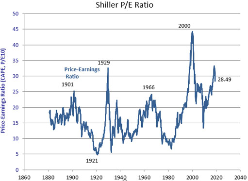
The forward rate of return on U.S. equities is a little more complicated. First, we have to calculate the cash yield, which we can accomplish by first taking the inverse of the market’s Price to Earnings ratio to arrive at an earnings yield and then making an assumption about how much cash flow as a percentage of earnings is available to be returned to shareholders after all maintenance capital expenditures and acquisitions. Because the S&P 500 is the most analyzed index and encompasses the majority of the U.S. equity market, we’ll use it as a proxy for U.S. equities. There are a variety of methodologies to compute the Price to Earnings ratio of the S&P 500, so it makes sense to us to use one popular more conservative methodology and one popular more aggressive methodology. The conservative methodology we’ll use is called the Shiller P/E ratio, which uses trailing cyclically-adjusted earnings as its denominator. According to this methodology (see below[4]), the S&P 500 is currently trading at 28.5x earnings.
The more aggressive methodology we’ll use is Yardeni Research’s P/E ratio, which uses forward operating earnings (not cyclically adjusted and excludes items management claims are non-recurring). According to this methodology, the S&P 500 currently trades at 14.6x earnings.
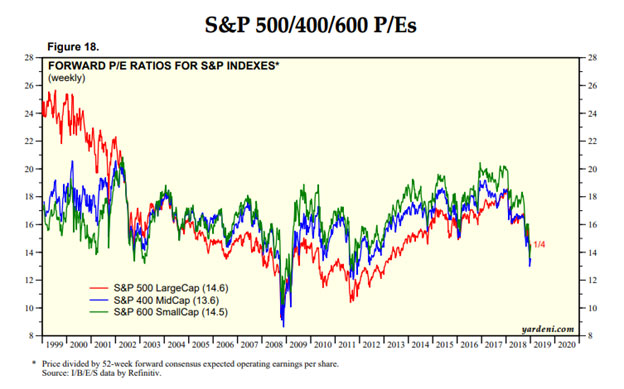
Taking the inverse of these two P/E ratios, we get somewhere between a 3.5% and 6.8% earnings yield. In a research report prepared by Goldman Sachs about a year and half ago,[5] their valuation numbers implied that free cash flow available to be returned to shareholders equated to roughly 75% of forward earnings estimates. While in the ballpark, this number seems slightly higher than other estimates we’ve seen, so, to be conservative, let’s use 67% instead. Multiplying our earnings yields by 67% results in a cash yield for the S&P 500 between 2.3% and a 4.6%, for an average of 3.5%. Given that the S&P’s dividend yield is currently 2.1% and S&P 500 constituents, in aggregate, return a substantial portion of their capital through share repurchases, this 3.5% cash yield seems reasonable. Notice this cash yield is already materially higher than those of cash, 30-year Treasury bonds, and 6-month Treasury bills. But, unlike the cash yields of cash, bonds, and bills, the S&P 500 cash yield should actually grow over time, with a terminal growth rate that is likely to roughly track U.S. Gross Domestic Product (GDP) growth.
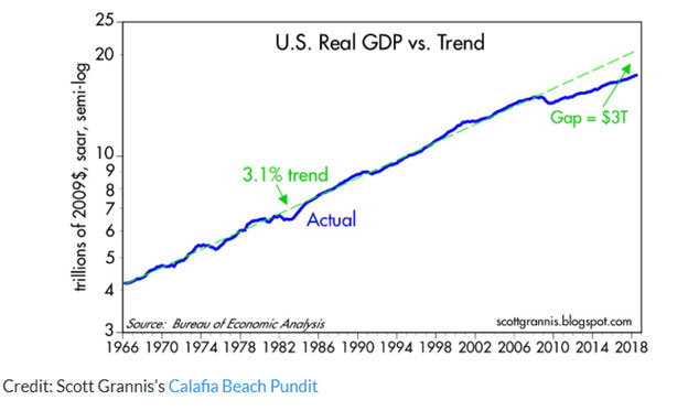
The U.S., as shown in the chart above, has grown its GDP by around 3% historically (made up of 1% labor growth and 2% productivity growth). While recent growth has been below trend, averaging less than 1.5% per year over the ten years ending in 2017, we think continued labor growth and at least some reacceleration of productivity growth are likely. Therefore, we estimate real GDP will grow by approximately 2% per year over time. Because of inflation, we believe nominal GDP will grow even faster. While inflation has historically added 2.9% to nominal GDP, given the United States’ high Federal Debt to GDP ratio,[6] we believe the long-term inflation rate is likely to be 3% or higher.
Adding our estimated cash yields of 2.3% to 4.6% to our estimated nominal GDP growth rate of 5% results in a forward rate of return somewhere between 7.3% and 9.6% with a midpoint of 8.5%. Thus, by our estimation, the long-term forward rate of return on U.S. equities continues to be much higher than those of Treasury bills and bonds and by at least the same margin (roughly 6.0% for bills versus a historical average of 5.9% and 5.5% for bonds versus a historical average of 4.7%). Additionally, equities held for over a year continue to be taxed at far more favorable rates than interest income, with the top marginal capital gains tax rate of 20% remaining well below the top marginal income tax rate of 37%.
Importantly, our forward rate of return estimates for U.S. equities are terminal and do not account for changes in net profit margins, taxes, interest rates, or P/E multiples. Given that net profit margins are above average[7], taxes and interest rates are below average, and valuations are very rich relative to historical averages, 10-year returns could be materially lower than the terminal rates stated above if there are regressions to the mean. On the other hand, these variables may not regress to their historical averages – they didn’t the last ten years, and there are plausible arguments why they still may not. Additionally, given high U.S. and global debt levels, inflation may be higher than expected, making cash and bonds a worse investment relative to U.S. equities. Whether there is a reversion to the mean in any of these variables or not, what is instructive is the relative gap in real returns, both historically and seemingly looking forward, among the various asset classes. Thus, after considering these possible scenarios (and many others), we still believe U.S. equities hold the strongest likelihood to grow their purchasing power relative to the other alternatives, even over the next ten years and particularly from a terminal perspective.
In conclusion, though short-term volatility is the risk most frequently discussed by market commentators and investors, for the long-term investor with small annual cash needs relative to the size of his or her portfolio, we believe an asset class’s likelihood of maintaining or growing purchasing power is a far more relevant measure of risk. And, on this measure, both historical and forward rate of return analyses strongly suggest that equities are much less risky than the supposedly “risk-free” asset classes of cash, short-term government bills, and long-term government bonds.
Concluding thoughts
While remaining invested during market declines is hard, there are many steps one can take to ease the pain. For us, continuously rechecking and revisiting the analysis above is probably one of the two most powerful mediators of our emotions, enabling us to flip from fear to excitement since market downturns offer opportunities to both upgrade the portfolio and invest additional savings at even cheaper prices. The second mediator is the process of scanning through our list of securities and remembering their simplicity, longevity, market dominance, ability to withstand turmoil, and importance to society. While the prices of businesses like L’Oreal, Charles Schwab, Mastercard, Nike, and CBRE Group may go down in the short term, as long-term investors, do these declines really matter if we believe these businesses are highly likely to be selling more services to more people in ten and twenty years with the market very likely recognizing this growth through higher stock prices? We think not, and we believe this viewpoint is especially valid when one considers that, in many cases, market downturns are helpful to dominant players since the weaker players are weeded out or can be acquired at distressed prices.
If you find yourself feeling nervous about the stock market, we hope you’ll find similar value in this analysis and these tools for managing emotions, and, as always, please let us know if there is anything you need. We are here to help.
Sincerely,
The YCG Team
Disclaimer: The specific securities identified and discussed should not be considered a recommendation to purchase or sell any particular security nor were they selected based on profitability. Rather, this commentary is presented solely for the purpose of illustrating YCG’s investment approach. These commentaries contain our views and opinions at the time such commentaries were written and are subject to change thereafter. The securities discussed do not necessarily reflect current recommendations nor do they represent an account’s entire portfolio and in the aggregate may represent only a small percentage of an account’s portfolio holdings. A complete list of all securities recommended for the immediately preceding year is available upon request. These commentaries may include “forward looking statements” which may or may not be accurate in the long-term. It should not be assumed that any of the securities transactions or holdings discussed were or will prove to be profitable. S&P stands for Standard & Poor’s. All S&P data is provided “as is.” In no event, shall S&P, its affiliates or any S&P data provider have any liability of any kind in connection with the S&P data. MSCI stands for Morgan Stanley Capital International. All MSCI data is provided “as is.” In no event, shall MSCI, its affiliates or any MSCI data provider have any liability of any kind in connection with the MSCI data. Past performance is no guarantee of future results.
[1] For information on the performance of our separate account composite strategies, please visit www.ycginvestments.com/performance. For information about your specific account performance, please contact us at (512) 505-2347 or email [email protected].
[2] Data for the chart was sourced from https://www.officialdata.org/1900-dollars-in-2017?amount=100.
[3] Data for the chart was sourced from https://www.ctj.org/pdf/regcg.pdf and https://www.taxpolicycenter.org/sites/default/files/legacy/taxfacts/content/PDF/toprate_historical.pdf.
[4] Data for this chart was sourced from http://www.econ.yale.edu/~shiller/data.htm.
[5] See https://www.cnbc.com/2017/08/03/goldman-cash-flow-market-looks-cheap.html.
[6] See https://fred.stlouisfed.org/series/GFDEGDQ188S.
[7] Even Shiller’s cyclically adjusted net profit margins are well above average, despite the Shiller CAPE being a metric that strives to smooth for business cycles and margin cyclicality


